Find your ideal resting nook and recharge!
Role
Designer, Researcher
Software
Figma
Outcome
A mobile application that enables students to discover and locate optimal resting spots on campus.
The application helps users:
1. Normalize & Encourage breaks
2. Provide tailored resting plans
3. Enable indoor/outdoor navigation
Discovery
Context
Many Cornell students juggle demanding, back-to-back schedules. Unable to find proper resting spaces on campus, they resort to napping in uncomfortable chairs and corners.
Challenge Identification
Through 10 contextual interviews with Cornell students taking over 20 credits worth of courses, we combined and analyzed the interview findings and learned 4 main insights:
-
Most participants prefer staying on campus between classes.
-
The lack of available information on campus amenities makes it difficult for participants to find resting spaces, forcing them to discover the spaces themselves.
-
Participants prefer spaces with specific criteria (i.e. noise level, furniture, etc).
-
Social affordances and expectations, such as others’ behaviors, can influence how participants understand and interact with a space.

(Affinity Diagram of Interview Findings)
How might we help Cornell students discover comfortable and convenient resting spaces on campus to rejuvenate and recharge?
User Persona (Shortened)
Interview findings are translated into a user persona to understand our target user group and guide our design decisions.
Frustrations
-
Balancing academic and personal commitments
-
Unfamiliar with campus amenities
-
Sleep deprivation and burn-out
Background
-
First-year Master’s student at Cornell
-
Takes 18 course credits, in addition to TA and research commitments
-
Has 2-hour gaps between classes on Tuesdays and Thursdays but often stays on campus because she lives 20 minutes away from campus.

Design Requirements
User needs and frustrations guided the development of 5 design requirements that highlight our design approach and intentions.
#1 Understand Users
The design should account for the student’s background & class/meeting locations to provide the most convenient and accessible resting spots
#4 Easy to Use
The design should be accessible to the user and easy-to-use on the go.
#2 Evaluate Spaces
The design should provide a comprehensive analysis of resting spaces depending on certain criteria (lighting, furniture, sound, social activities, etc.)
#3 Normalize Resting
The design should encourage and normalize resting on campus (social norms)
#5 Tailored Solution
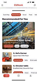
The design should generate a ready-to-be-used list of recommended places based on simple user inputs
Ideation
Solution Space & Opportunity
Both physical and digital products are analyzed to identify design opportunities. Our analysis reveals a gap in existing products that fail to offer affordances while enabling users to obtain customized recommendations and navigate to the selected locations.
Standardization

"Chill Here" Signs
Provides guidelines on how the spaces should/could be used

Apple Map "Look Inside"
Allows travelers to access interior maps of airports

Cornell Library Website
Helps students navigate study spaces on campus.
Affordance
Navigation
?
Resting-related
Non-resting-related

Airbnb
Offers listings with ratings, photos, and evaluation criteria for different users.
Customization
Brainstorm & Design Selection
Based on our findings, each member developed 20 designs, totaling 100 product ideas. I led the discussion to narrow our design scope. We grouped the ideas by various features and functions, finally voting to select four key features for CUNook.

(Design Selection Process)
4 Key Features
After synthesizing the design ideas and sketches from each group member, we came up with four key features to fulfill our users' needs.
#1
User-friendly Onboarding
Allow users to set preferences using keywords and scale bars for tailored recommendations.
#2
Tailored Resting Plan
Push notifications for schedule-based resting space
recommendations.
#3
Indoor/Outdoor Navigation
Map and AR that provide seamless guidance for users.
#4
User Reviews
Refine & improve through user reviews in the form of ratings, pictures, and keyword labels.
Storyboard (Example)
We each developed a scenario and storyboard for one feature to visualize the user journey and interaction with our solution.
In this story I created, the user has a 2-hour break in between their classes and seeks nearby resting spaces. Linked to their schedule, CUNook detects the break and notifies the user with personalized recommendations, allowing users to easily navigate to their desired resting location.

New to the campus, Mia is unsure where she could spend her 2-hour break after class.
Just then, she receives a notification: "You have a 2-hour break coming up! Do you want to rest here?"
Intrigued, Mia opens the app to see a list of three available resting spaces nearby.
After a quick scan through the recommendations, Mia selects the first option.
A real-time map shows up, ready to guide her to the selected resting spot.
Five minutes later, Mia arrives at the space, relieved to begin her much needed break.
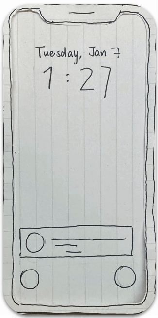
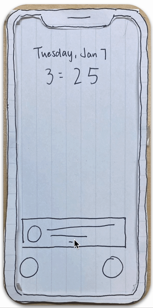
Prototype
Low-Fidelity
My low-fidelity prototype focused on usability and interaction flows, allowing users to interact with buttons and input boxes. Visual properties and realistic contents are filtered out to reduce distraction and encourage participants to focus on usability.

Mid-Fidelity
We conducted 5 user testing sessions on the low-fidelity prototype and consolidated insights, identifying key areas of improvement and incorporating the findings into our mid-fidelity Figma prototype.

Through an iterative process, we each conducted 5 additional user testing sessions on the mid-fidelity prototype, evaluating the app's heuristic designs and usability.
Usability Testing & Heuristic Evaluation
We asked 5 participants to complete 4 tasks using the Figma prototype and follow the Think-aloud protocol. The key tasks were chosen to simulate real-life scenarios of a typical Cornell student, allowing us to obtain feedback on the core features. We concluded each session with a Q&A to gather additional information from users.
#1 Speak user's language
Added more button variants and changed the slider UI into a more quantifiable magnitude.
#2 User control
Include “no” as an option for calendar and camera access.
#3 Visibility of status
Create interaction for all tags.


.png)

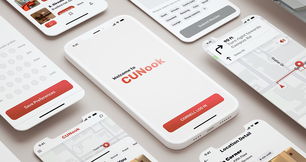
Final Product (Key Frames)
#1
User-friendly Onboarding
Allow users to set preferences using keywords and scale bars for tailored recommendations.

Keyword Labels

Simple Scale
Help users define their needs in a low-stress way.
#2
Tailored Resting Plan
Push notifications for schedule-based resting space
recommendations.
Notification
Remind users to take breaks.

Location-Specific
Recommendations


Keyword Filters
Concise Information
Prevent info-overload and simplify decision making.
#3
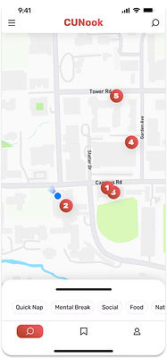
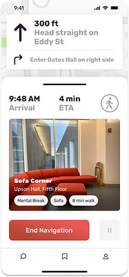
Indoor/Outdoor Navigation
Map and AR that provide seamless guidance for users.


Distinguish
between outdoor/indoor navigation to minimize confusion.

User Control
Allow user to pause/end navigation upon entering a building
#4
User Reviews
Refine & improve through user reviews in the form of ratings, pictures, and keyword labels.


An integrated work destination where interactions happen